Limoncello

About:
An identity with a little Italian wit. Limoncello pairs an illustrated emblem with classic typography across the restaurant's printed touchpoints.
Year
Client
Limoncello
Services
Brand & Print
Industry
Hospitality
Creative Direction:
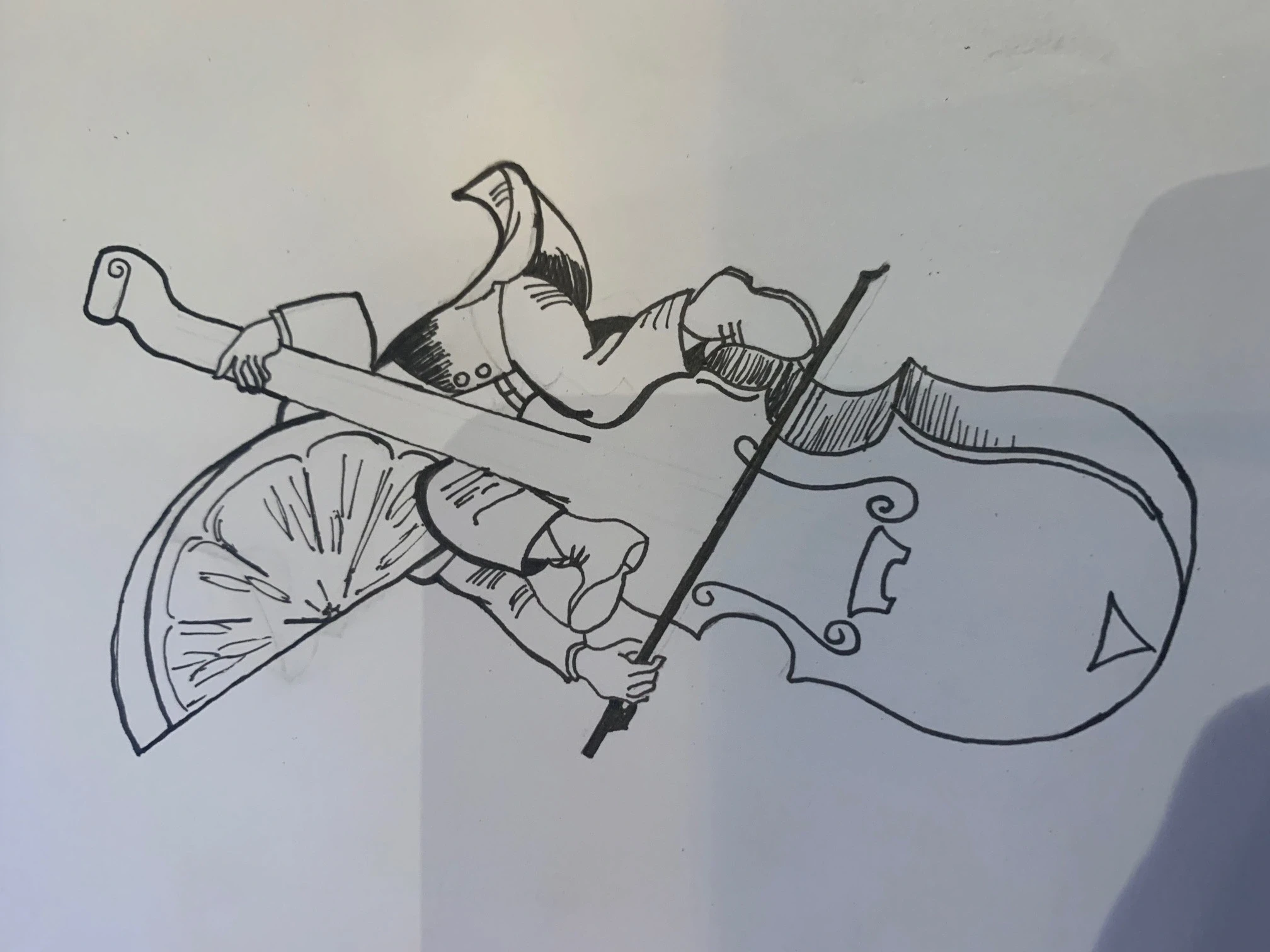
A name brought to life.
A lemon, a cello and a wine bottle meet in one distinctive illustration. The original drawing reveals the idea behind the finished restaurant mark.
Selected Expressions:
From the first impression to the table.
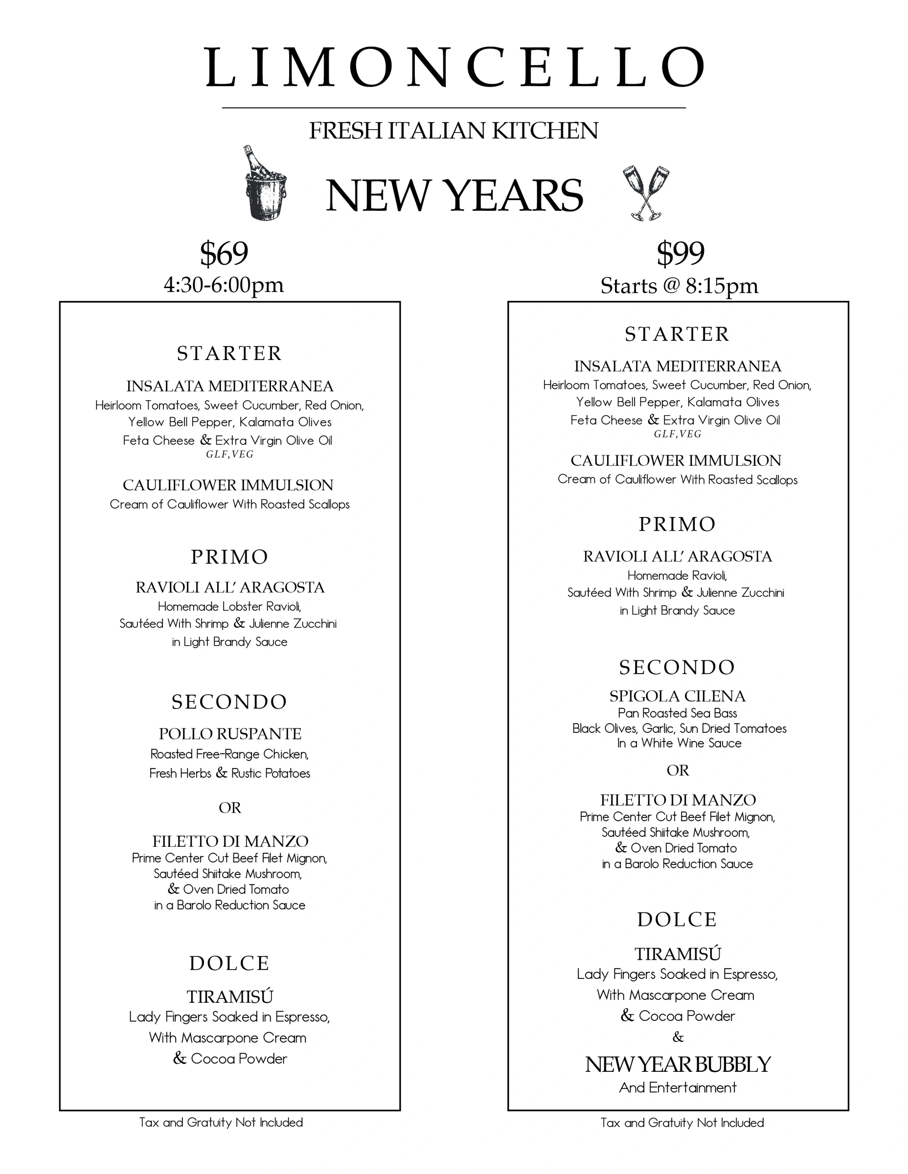
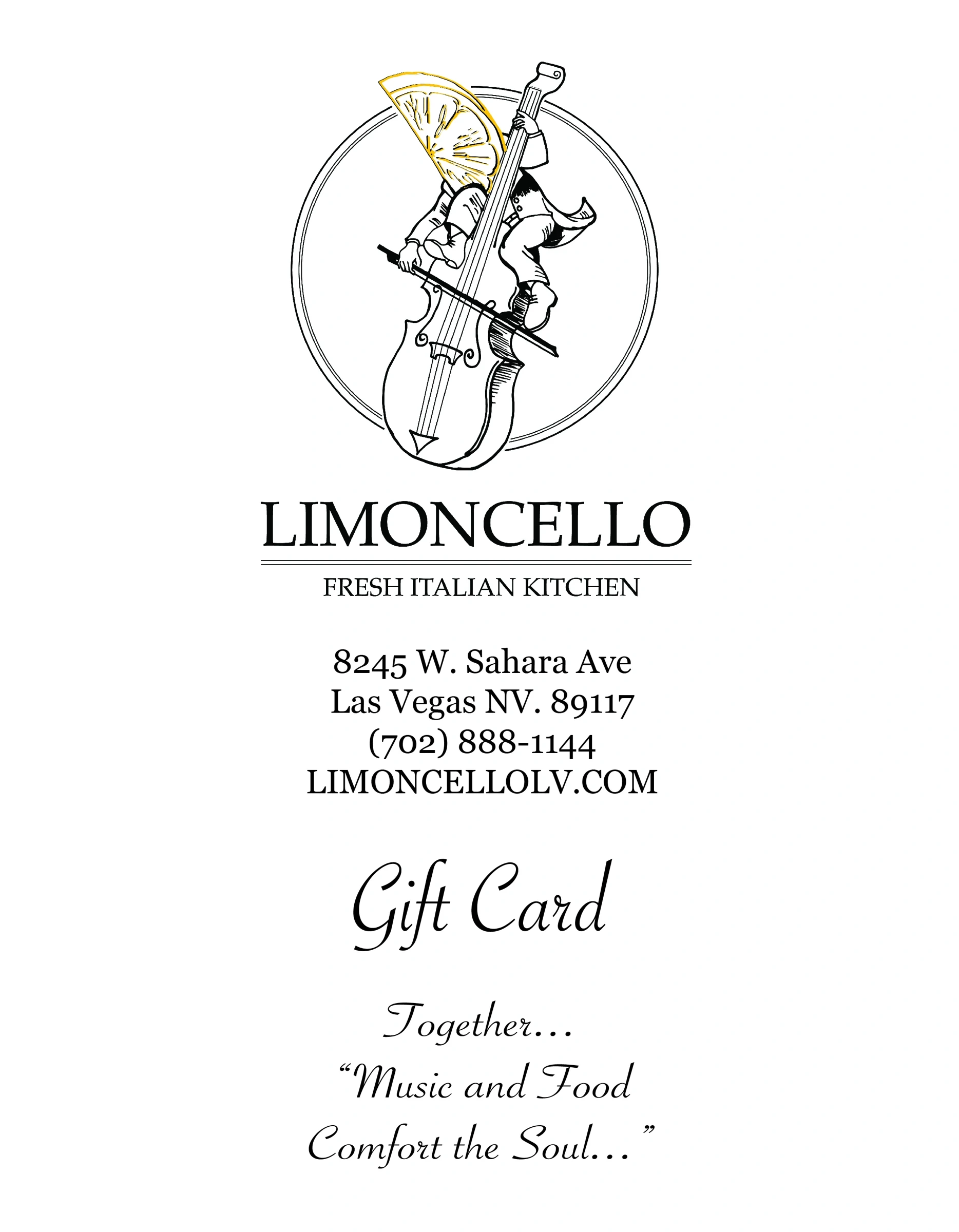
The selected work includes the identity, a New Year's menu and gift-card design, carried by restrained typography and a clear, elegant hierarchy.